


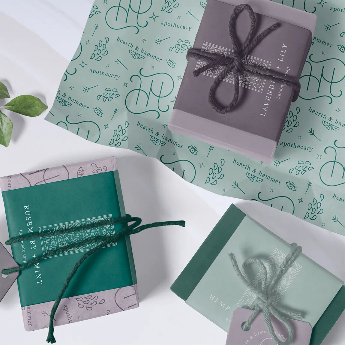
The solution for this brand identity fuses the time-honoured practice of alchemy with contemporary science, achieved through the use of a traditional serif font and an enchanting colour palette.
Drawing inspiration from tarot cards, the branding showcases the mystical world of witchcraft and potion-making, with the main illustration and brand pattern seamlessly encapsulating these themes.
The overall aesthetic embodies sophistication and classicism, elegantly contrasting with the modern brick-and-mortar location of the shop, effectively marrying the past with the present.


Upon our initial consultation Emma cut through all the noise to really understand what I was trying to achieve without me even knowing what it was I even wanted! An absolute genius!
And when she delivered the new brand, it quite literally brought me to tears (and this is coming from the person who has never really overly liked many designers work!) - It was everything I could have asked for and so so much more.
We have since continued working together (with no intention of ever stopping if she will have me) to create ongoing digital assets for our brand, and Emma has gone above and beyond every single time!


This business transformed their brand and you could be next! If you’re ready to elevate your business with epic design work like this, let’s make it happen. Visit my enquiry page to start the conversation and take the first step towards building a brand you’re proud to share.
WORK WITH ME


