


.webp)


Balanced Accounts’ brand identity was developed to position the firm as a fresh, approachable alternative in the financial sector.
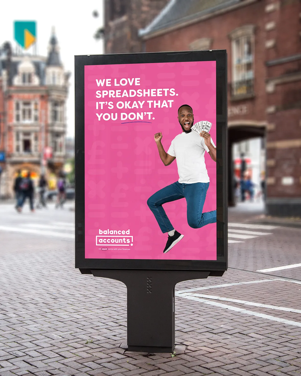
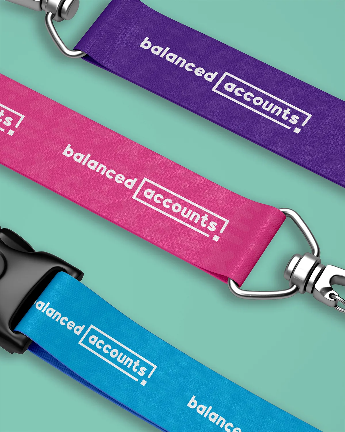
A colourful, primary school-inspired palette evokes simplicity and confidence, while rounded, sans-serif typography and lowercase lettering balance professionalism with playfulness. The logo references mathematical concepts and spreadsheets, reinforcing financial clarity. Friendly patterns using maths and money symbols, paired with diverse, quirky character illustrations and photography, break away from traditional corporate aesthetics.
This cohesive identity empowers clients to approach their finances with confidence, making accounting feel accessible and down-to-earth.

Working with Emma on the branding for my business was an absolute game-changer. As a startup, I had no existing identity but Emma took the time to understand my vision perfectly.
She created a brand that feels fresh, approachable and professional - exactly what I needed to stand out in the financial sector! The playful colour palette, clever logo design and engaging visuals truly reflect my mission to simplify accounting for busy professionals.
Emma’s creativity, attention to detail and collaborative approach made the whole process seamless. I couldn’t be happier with the results!


This business transformed their brand and you could be next! If you’re ready to elevate your business with epic design work like this, let’s make it happen. Visit my enquiry page to start the conversation and take the first step towards building a brand you’re proud to share.
WORK WITH ME


